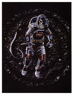
My illustration of Bane from "The Dark Knight Rises". Great film.
Monday, July 23, 2012
The Bat-Man Chronicles
My idea for the next Batman movies. Similar to the 1960's Batman but without the "camp". Brutal hand -to-hand combat style Batman with the one director who has a proven track record in this style of film: Mr. Quentin Tarentino.
Labels:
Bat-Man,
Batman,
Chronicles,
Quentin Tarentino
Tuesday, April 3, 2012
New DC Comics Logo in a Circle Rather than Rectangle
Here we are on "New Comic Book Day Eve" and I'm checking out the preview of Action Comics #8 on MTV Geek. I couldn't help notice that the "New DC logo" this month is placed in a black vertical rectangle. (Almost "Marvel Comics" like) Last month it was within a banner atop of all DC Comics promoting the "We Can Be Heroes" initiative. At first I wasn't a big fan of the new DC logo (as many were) when it was first announced. The images that initially appeared online seemed to be very "sterile" and "corporate. Since that time though, I've warmed up to the new logo and see it's potential. I can't wait to see how it is used/animated at the begining of "The Dark Knight Rises" this summer. The application of this logo for the April books in a vertical black box though just doesn't say to me "DC Comics are AWESOME!!!" I looked at it for a while, pondered, then threw together this mock-up version showing the DC Comics logo in a circle. The new DC logo in a circle is a nod to the past, while still keeping with the "New 52" style looking to the future with digital publishing and other electronic media applications. I posted this image to DC Comics on Twitter. Since the new logo is still in development, I wonder if they would consider something like I've done. (probably not, since they've probably spent a boatload of $$ developing the new logo and had focus groups aplenty give their input). Either way it was fun and I personally like it in a circle. -L.
Thursday, February 16, 2012
Friday, January 20, 2012
Looking at DC Comics "new" logo, I originally didn't like it. After seeing it with some color and some different variations I actually dig it. I thought though, since I'm more of a traditionalist when it comes to my comics, that it needed some element to tie it to the older logos. My favorite DC logo is the "bullet" that appeared on DC Comics from the late 70's through the first decade of the 2000's so I added a "star" to the new logo just to see how it looks. Whaddya think?
Friday, January 6, 2012
Episode Nineteen - "Honor and Insanity"
This piece was done for the online radio drama for Pendant Audio's "Seminar", episode# 19. The episode titled; "Honor and Insanity" premiered online September 19, 2008. Check it out!
Subscribe to:
Comments (Atom)


